How to Design Custom Typography for an Awareness Campaign
Raising awareness around a cause often begins with a single visual moment. A poster on a community board, a digital banner on social media, or a flyer handed out at an event can spark curiosity before a single word is read.
Typography plays a powerful role in shaping that first impression. The way letters curve, stack, or stretch across a design can communicate urgency, empathy, or hope without relying on heavy imagery. Learning how to shape custom typography gives campaign creators a way to speak visually, even before the message itself is absorbed.
The global font and typeface market is, therefore, growing steadily, with revenue around $8.2 billion in 2024. It is projected to reach about $12.5 billion by 2033, with a 5% CAGR from 2026 to 2033. The expansion is driven by increasing demand for diverse and innovative typefaces across digital platforms, e-commerce, branding, and social media.
Designing type for an awareness campaign does not require a background in professional graphic design. With a clear understanding of tone, free online tools, and simple design methods, plain text can be transformed into something that carries emotional weight and clarity. The goal is to create lettering that feels connected to the subject, audience, and platform where it will be seen.
Understanding the Purpose Behind Your Message
Every awareness campaign begins with a reason for being. Some aim to inform, others to encourage action, and many try to build empathy around complex issues.
For example, 1 in 3 US adults has prediabetes. However, around 80% of them don’t know about it. Therefore, the Centers for Disease Control and Prevention launched an awareness campaign in 2016. The campaign has evolved since then and spread prediabetes awareness to millions of Americans. Data shows that over 7.1 million people have visited its dedicated website by 2024. Moreover, 2.1 million have completed the online prediabetes risk test after watching the ad.
There are many such examples for different types of awareness, and with a wide range of goals and intentions. Typography should reflect that intention. A calm, rounded font can suggest care and support, while sharp, bold lettering can convey urgency and call for attention.
Before opening any design tool, take a moment to define what you want the reader to feel when they see your text. Is the message meant to comfort, educate, or motivate? This emotional direction will guide decisions about font style, spacing, and layout.
Using Typography to Support Sensitive Topics
Some awareness campaigns focus on topics that require a thoughtful, respectful tone. Typography can help maintain that balance. Soft curves, moderate contrast, and gentle spacing often feel more approachable for sensitive messages.
A campaign addressing legal or social challenges might include educational content about how individuals seek help or accountability. For example, there’s a significant leap in gambling addiction after the legalization of sports betting.
It is driven by the seamless tech experience, aggressive industry promotion, and easy financial access that make betting ubiquitous and appealing. This can lead to mental health problems, as highlighted by the gambling addiction lawsuit.
According to TorHoerman Law, users allege that many sports betting companies, including DraftKings and FanDuel, intentionally design their platforms to be addictive. VIP perks, easy access, constant push notifications, risk-free promotions, etc., are encouraging regular bets and causing mental health problems.
When discussing sensitive topics, the surrounding typography should avoid a sense of aggression or sensationalism. Instead, a clean and steady style can help keep the focus on clarity and support. Readers are more likely to engage with content that feels carefully presented and easy to understand, especially when the topic carries emotional weight.
Choosing a Visual Style That Fits the Campaign
Awareness projects often benefit from a consistent visual language. This includes color choices, imagery, and typography that work together rather than compete for attention.
Visual effects (VFX), such as narrative structure, color grading, green screen, and compositing, are used in awareness campaign videos to enhance storytelling and emotional impact. A study finds that narrative structure, color grading, and typography are most frequently used to strengthen visual clarity and reinforce key messages. Green screen and compositing appear more often in documentary-style campaigns.
Custom typography can act as the anchor that ties everything together. For campaigns shared across multiple platforms, flexibility matters. A design that looks good on a printed flyer should also adapt to a social media graphic or website banner. Testing how your text appears in different sizes and formats helps avoid designs that feel cramped or unclear when scaled down.
In many advocacy and support-driven projects, designers also create materials for educational use, such as classroom posters or community handouts. In these contexts, readability becomes just as important as style. Letters should be distinct, clean, and easy to follow, even from a distance.
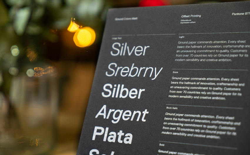
Shaping Letters with Online Design Tools
A study analyzed thousands of real-world font-use cases to reveal how designers select and pair typefaces across different media. It found that most designs use about 2 fonts on average, with Sans-Serif families like Helvetica and Futura dominating both single-use and paired use.
Statistical and machine-learning models show that font choices vary by medium:
- Print favors Serif styles.
- Advertising leans toward more decorative fonts.
- Digital platforms prefer thicker, bolder types.
Network analysis highlights Helvetica, Futura, and Univers as central, highly versatile fonts that frequently connect with others.
You can experiment with such fonts to create your own custom typography. Modern design platforms make it possible to customize text in ways that once required advanced software. Curved text generators, font editors, and mockup tools allow creators to preview how their typography will look on posters, merchandise, or digital screens.
Experimenting with these tools can reveal how small adjustments change the overall tone of a design. Bending text into an arc can make a headline feel welcoming or celebratory. Applying subtle shadows or outlines can improve legibility against busy backgrounds. These choices help transform standard fonts into something that feels tailored to the campaign’s purpose.
Frequently Asked Questions
What role does cultural context play in selecting fonts for global campaigns?
Cultural expectations around typography can vary widely across regions and languages. Some type styles may feel formal, casual, or even inappropriate depending on the audience. Designers working on global awareness campaigns often research local visual norms and script preferences to ensure their typography feels respectful and relatable.
How can typography support storytelling in video-based awareness content?
In video campaigns, typography can appear as animated titles, captions, or on-screen text that reinforces key points. Movement, timing, and transitions help guide viewers’ attention and emphasize emotional moments. Well-designed type animation can make complex information easier to follow while keeping the visual experience engaging without overwhelming the main narrative.
What are the legal considerations around using custom or licensed fonts?
Fonts are intellectual property, and many require proper licensing for commercial or public use. Designers should check whether a font allows use in printed materials, digital content, or merchandise. Awareness campaigns, especially those tied to organizations or fundraising efforts, often need licenses that cover broad distribution to avoid legal or compliance issues later.
Custom typography has the ability to turn words into a visual experience that resonates beyond the page or screen. In awareness campaigns, where every detail can influence how a message is received, thoughtful letter design adds depth and intention to the communication.
With a clear purpose, a consistent style, and the help of accessible design tools, creators can shape text that informs, supports, and inspires. When typography and message work together, they create a lasting impression that encourages people to pause, reflect, and engage with the cause.